October 1st last year was a day for celebration for Facebook. After trial runs in a couple of countries, Instagram finally became a medium for advertisements. In the Netherlands, Hellman’s (a Unilever brand) was the first one to use it. Another Instagram advertising pioneer was Heineken. Although there was some negativity about the user experience of Instagram ads in the beginning, we can finally concentrate on the quality, creativity and performance of the ads.
In this article, I’ll point out how a simple, visual trick helped me to double the interaction with an Instagram ad, while decreasing the CPO (cost per order) with 82 percent.
The problem
During the launch event on the 30th September in Amsterdam, Facebook recommended not to copy Facebook ads to Instagram, and above all to be creative. To accomplish this, Facebook offers four advertisement types for Instagram: link, video, app install and carousel ads.
Carousel ads
Especially carousel ads have evolved tremendously lately. By the end of 2014, Facebook initially introduced this format as multi-product ads. The advertiser can put up to five visuals with corresponding texts and headings in this ad, instead of just a single one. Soon people were using this format not only to show multiple products, but to display a single product from multiple angles.
At first glance, this ad format is perfect to give your creativity free reign, and by doing so, to follow Facebook’s advice for a successful Instagram campaign. But there’s one small problem: while Facebook users always see one and a half of these so-called ‘cards’, because these cards have a clear outline, the visual cues that the cards are scrollable are far less obvious on Instagram.
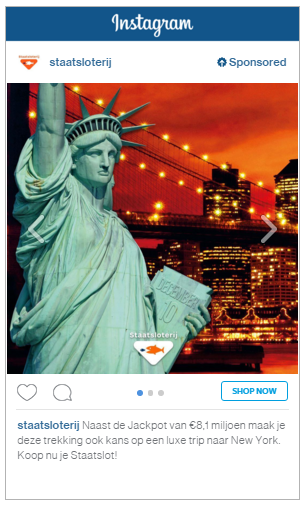
Example of a carousel ad on Instagram
The solution
Apart from the three dots at the bottom and the almost invisible arrows on the sides of the visual, it’s the advertiser’s job to seduce the user to scroll further to the right. For brands, a second, third or fourth visual (four is the maximum amount of cards in an Instagram carousel ad) is a great opportunity to show their audience multiple messages. Whether these cards show extra USPs, or are intended to inspire the user: the more engaged the user is, the higher the chance of ad and brand recognition.
At Blue Mango Interactive we faced a problem. Our client, the Dutch Staatsloterij (national lotery), wanted to show their target audience that they can win the jackpot and a trip to New York. We decided to replicate the white border between the cards, just like on Facebook. By doing so, we managed to stimulate the desired interaction. At first glance, this solution looks very simple, but that doesn’t make it less effective. Below you see the ‘old’ Instagram on the left, and the new ad with the added white stroke on the right.
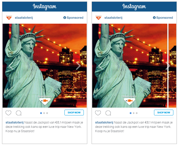
The results
What metrics does one use to review the scrolling behaviour in an ad? Ideally, Facebook would make this data available per card. The percentage of users that scrolls and/or scrolls to the last card is interesting data that could be used to optimize this ad format. Because this data is not (yet) available, we have to manage with the info that Facebook has to offer: clicks on a card and conversion tracking. We assume that if there are more clicks on later cards, these cards have been viewed more and had more user interaction.
Increased purchase intention
What are the results of this creative solution? Adding the white stroke in the carousel ad only increased the CTR (click through rate) with 3%. However, the percentage of clicks on cards two and three increased with 104%. We also saw a clear effect in sales. The conversion ratio to transaction was seven times higher, and the cost per transaction dropped with 82%! These figures indicate that the clicks on the ad with the white stroke were far more valuable, compared to the clicks on the default ad. We can carefully conclude that the extra USPs that were displayed in card two (extra prizes) and card three (the jackpot), have increased the purchase intention.
What’s to be expected?
According to the most recent figures, 722.000 Dutch people are using Instagram on a daily basis. Internationally it’s the fastest growing social media channel ever, it has a bigger user base than Twitter, and it reached the 400 million users milestone faster than its big brother Facebook.
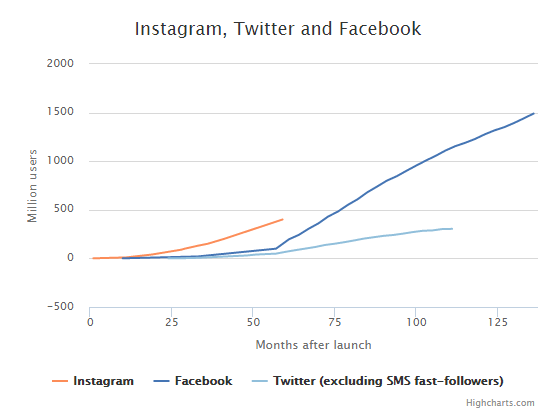
Growth of Instagram compared to Facebook and Twitter. Via highcarts.com.
Advertising on Instagram, however, has only just begun. It’s to be expected that Facebook will improve the ad formats in the months and years to come. Facebook will analyse the behaviour of the Instagram users and offers the advertisers ad formats that match the brand. Until then, we will wait for the first advertisement formats that are especially developed for the Instagram and match the medium’s properties. We will make due! After all, it’s the advertiser’s job to come up with smart and creative solutions to achieve the desired results.
In this article I showed a simple way to solve the problem of the low visibility of the scroll options in carousel ads. If you’ve already started working with Instagram ads, you might have faced a similar problem. I’m very curious how you solved it. Please let me know by leaving a comment below!


Leave a Reply
You must be logged in to post a comment.