In this article I will explain why and how to use data and scenario mapping to supply a consumer friendly message. It’s impressive to see how much data, technology and innovation is used to make online marketing ads work the way they do. Our goal is to show the right message to the right person at the right time, and to seduce the visitor to click. To optimize the conversion rate of these ads we use psychological hypotheses and neuromarketing techniques. Through AB testing we know exactly what works. This varies from positioning a call to action to the left or right, to the way we address the visitor or in the way we communicate a message.
All these experiments deliver stunning insights. But oddly enough, often we pay no attention to the touchpoint where visitors land after clicking on an ad. The landing page is an overlooked marketing instrument. Why is that?
This has to do with the mindset of many online marketers. Methods used in traditional e-commerce will not work for all businesses. An e-commerce website often focuses on the direct sale of a product and wants to convert visitors to the ‘thanks’ page as soon as possible. This approach can work for products that consumers purchase online easily. For expensive products or extended subscriptions (for example) this works differently. Someone who wants to buy a car or wants to apply for a new insurance, will start orienting first; comparing prices, suppliers and specifications. It could work counterproductive if you send these visitors directly into a sales funnel.
For example: Asking to fill in a contact form can be very obtrusive and not consumer friendly, if the visitor is expecting to read about what the main profits are, let’s say for an health insurance.
Kid gloves
The relatively low number of visitors that actually click on an online ad (0.12% worldwide, according to Google global display benchmarks), deserve to be treated with kid gloves. Make sure the story that you’re telling, the promise that you make, or the trigger that you induce is answered with a soft landing.
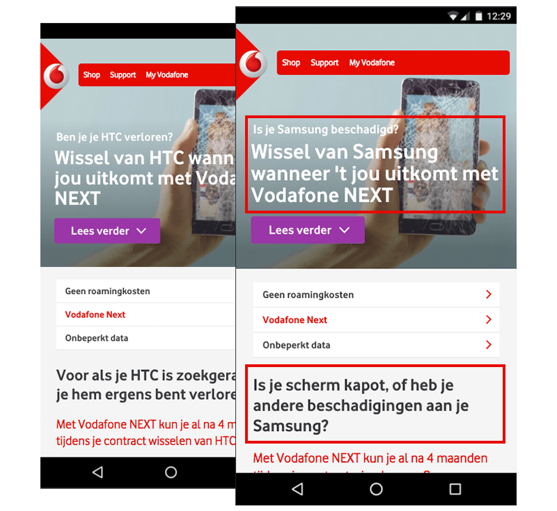
For Vodafone we personalised the message on the landing page according to the search keyword the visitor had typed into Google.
Context first approach (no buzzword intended)
Start your design phase with a context first approach. You can use methods like customer journey mapping or user scenario mapping to create ideas that will shape your dynamic, or adaptive landing page. Adjust the content, layout and interface of the page to what you know of the visitor.
For a positive user or brand experience you have to map all possible scenarios starting with (for example) the visitor that clicks your ad.
Ask yourself questions like: Who is the user, where are they and why are they doing what they are doing?
Or which Google search led to the click? It may well be that this particular visitor doesn’t want to buy a product at this moment.
Soft landing for each phase in the customer journey
Marketers already focus on specific stages of the consumer buying cycle, such as awareness, consideration, purchase and loyalty. Tune your advertising, but the landing page to this as well. Otherwise, you will generate traffic to a page that does not reflect the message you want to show to the visitor. And as a result, your conversion rate will drop, or even worse, your bounce rate will go up.
If the campaign is focused on branding, then it makes no sense to slingshot off the visitor as far as possible into the sales funnel.
How we use data and user scenario mapping to create a consumer friendly landing page
We noticed a high search volume for the keywords "test internet speed". Our client Vodafone offers a service like this, but did not appear in the search results. You want to be present at the time that the consumer is looking for information because this adds up to your brand salience (be on top of mind in buying situations). The more present you are, the more likely a consumer will think of your brand in the ‘zero moment of truth’.
So even if there is no occasion to sell your products, use your presence to provide a helpful, positive experience. Consumers will appreciate a non obtrusive message, and are more likely to accept a branded message.
So we launched an Adwords campaign, and created an adaptive landing page. The visitor was able to test his internet speed, and received an instant result combined with an advice.
The content of the landing page adapted to predefined scenarios, which were based on two variables:
- Internet connection speed
- If the visitor is an existing or non existing customer.
We used a user scenario map to visualise possible focus points. See an example below:
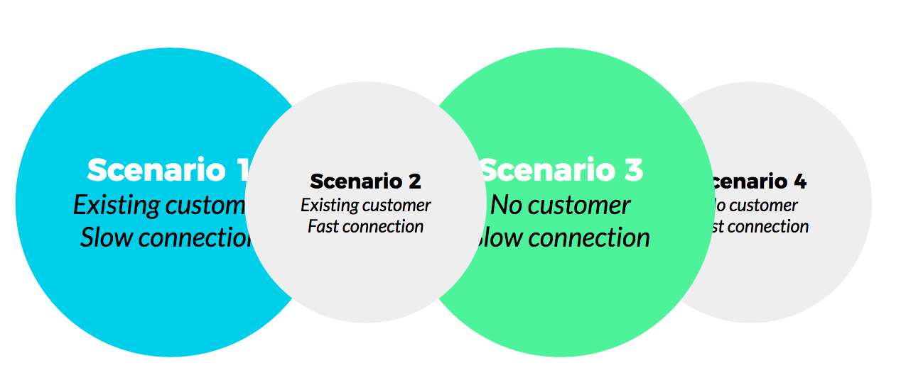
So an existing customer with a low internet speed result was given an advice to use Vodafone’s free support service to, for instance, optimise their wifi connection. Instead of showing every visitor the (same) sales message we utilised this moment to focus on retention. This is an example of what we like to call consumer friendly marketing.
Utilising micro moments
Especially during the micro-moments of the customer journey, the landing page is a very powerful tool. Besides showing the correct information, for example, you can ask for data, measure interaction, gather additional data and thus make super detailed segments for retargeting.

Image from Google
The following applies: the more personal, the better. But beware: being too personal is likely to backfire. For example: Showing a visitors purchase history on the wrong moment may have a negative effect on the feeling of privacy. However, you can use that purchase history to show the relevant USPs of certain products. That’s a form of unconscious personalisation.
A visitor who reaches you through Google and shows a high degree of knowledge in the search keywords (for example "Apple A10 Fusion Quad Core"), you would show something different than to someone who is at the beginning of the orientation phase. Your content should be as dynamic as possible. This is difficult, because under the hood of most websites exist cumbersome systems that won’t adapt so easily. A lot of companies are not so flexible to realise an adaptive page that reacts to different user scenarios.
Planting a seed
That does not make him less valuable – this is in fact the ideal time to plant a seed. Ask an opt-in for off-site notification ("Notify me when my subscription will end") or the option to bookmark ("Save these tips to read back later") the page. And voila, the seed is planted.
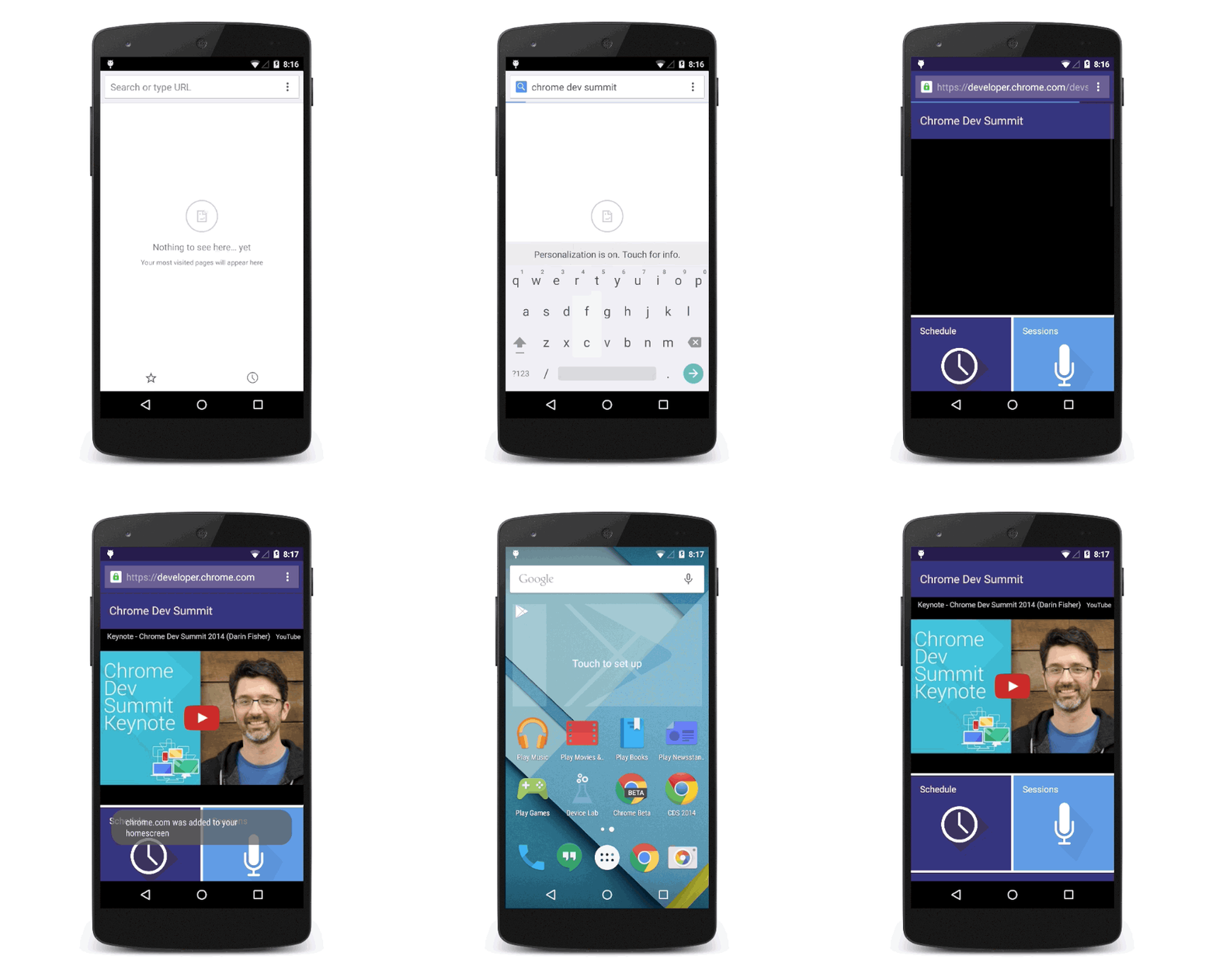
An example of the Chrome dev summit landing page, which offers an option to bookmark the page to the user’s homescreen. Here you see, a digital seed is planted.
So when will that seed bloom? For online marketers, it’s a challenge to create ads when it comes to customer centric marketing. We are still figuring out how to measure consumer friendliness, after all, what will be the conversion metric? It is for the marketers to come up with solutions, but also to convince their clients of this new way of thinking.
I’ve written this article together with Bart-Jan Hoogink.


Leave a Reply
You must be logged in to post a comment.