
In the responsive and adaptive web design movement a need for real world testing came along. There is and always will be a very wide variation of devices and operating systems. It’s important to think about what mobile devices should and should not be on your mobile device wall to maintain fast development. Without doubt, testing on unnecessary devices has a negative impact on your project’s timing and budget.
Supporting legacy stuff is time consuming. Gathering some insights on your client’s user analytics is a valuable investment.
A lot of mobile test labs are popping up around the world and that’s a good thing. Of course, an ideal situation is an app that is tested on all possible circumstances. But in a real world clients should only have to pay for actual beneficial improvement. Don’t just assume your app needs to work well on that Samsung Galaxy SII that’s sitting there on your mobile device wall.
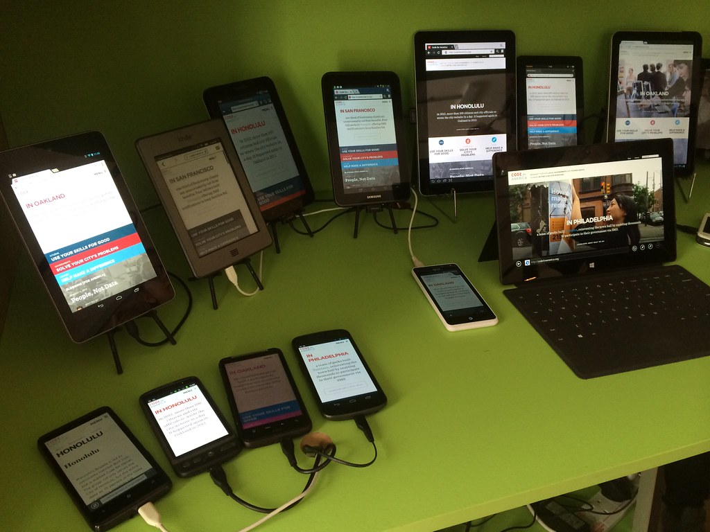 Image by Jeremy Keith
How to decide what mobile devices you should be testing on
How you manage your mobile device wall really depends on the kind of end user you support and the budget you have. Our approach is an inspiration on how to go about it yourself. Keep in mind that our decisions are made on how we think it’s best for us, it might be different for your situation. In most cases the key to success is to know who you are developing for.
We are an online marketing agency and develop products that vary from small banners and simple landing pages to full functional web apps and heavily animated webpages.
Our clients often need visually appealing promotional websites. At the same time we like to raise the bar to incorporate new techniques into our toolset. On the other hand we care a lot about supporting legacy browsers, since we are an online marketing company, everything is about getting the highest conversion ratio.
This means that we need to find a balance in what we use to test our products.
Rely on your client’s user analytics
We already assumed we were testing on obsolete devices. So we decided to start a research on how to cover the largest part of devices, and later on to keep our testing hours as low as possible. In our analytics results we found out that there is a is a large fragmentation of devices and OS versions, especially for Android (obviously). For example, this is a list of Samsung Galaxy S3 usage in our clients user base:
{<2>}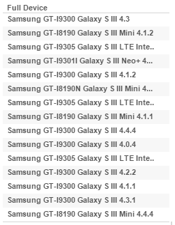
It’s not hard to conclude that this is impossible to test in a real life project, let alone doing this for all types of devices. We wanted to make decisions based on a more narrowed down analysis. The results below is an analysis our 5 biggest client’s websites gathered from a total visitor session amount of 35 million in the first 4 months of 2015.
{<3>}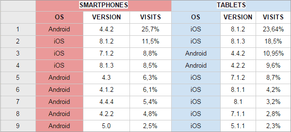
Consider device selection on similarities between operating systems and devices
We didn’t filter on specific iOS devices since Google Analytics doesn’t supply this information by default. Honestly we feel quite confident that there are no significant differences (device performance and resolution not considered) in website functionality behaviour between an iPad with (for instance) iOS8 or an iPhone with iOS8.
Be confident to use developer tools for viewport size impression
For responsive testing we use our devices and the Google Developer viewport rendering tool. It doesn’t beat checking your layout on actual devices but if you do this carefully it gives you a quick and reliable impression. It even offers simulation of network speed throttling. And if you aim to have your design fluid with content determined breakpoints then different screen sizes should give you no big surprises.
{<4>}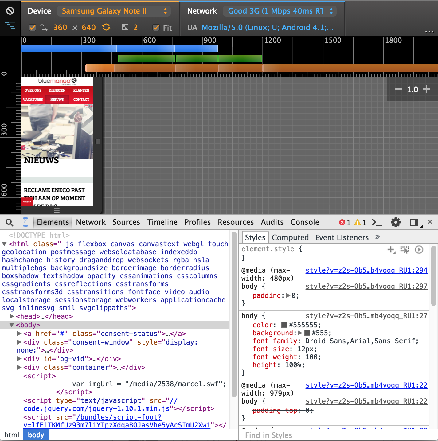
Our carefully composed list of mobile devices
This is our list of devices as we have it today. It is pretty basic but we feel there is no need to have more than this. We only cover the top 5 user scenarios. Every test device added is x amount of time added to project turnaround time. So we tried to be very selective.
- iPhone 4 (iOS 7)
Small resolution and slow device. If it works on this iPhone it works on all similar and higher versions of iPhone. iPhone 4 updates no higher than iOS7 and that’s what we wanted.
- iPad 4 (iOS 8)
Most used iOS version on a tablet of all. Retina screen. No need for newer tablets like the iPad Air.
- iPad 2 (iOS 7)
An older iOS tablet for performance testing.
- Samsung Galaxy Tab 3 Mini (Android 4.4.2)
Most used Android version on tablets and a smaller variation of resolution.
- Samsung Galaxy Tab 2 (Android 4.2)
Second most used Android version on tablets and still a widely used device. We expected that we didn’t have to support this device anymore but sadly our analytics proved us wrong.
- Samsung Galaxy S4 (Android 4.4.2)
Most used smartphone with the most used Android version of all.
- Samsung Galaxy S3 (Android 4.3)
Largely used Android device with second most used Android version.
These are devices we ditched:
- Samsung Galaxy SII (Android 3.1)
- iPhone 4S (This iPhone 4S had iOS6 and we needed iOS7. Updating an iPhone to a specific iOS version is not possible so we changed it with an iPhone 4 on iOS7)
- Samsung Galaxy Tab 1
- Some Ericsson
- Some Blackberry
How to harvest useful device and OS data from your client’s analytics
When you’re using data for your mobile wall, you’ll want to automate that data. For a basic check, we look at the Google Analytics data of five big clients. For the dataset, we use the following three statistics:
- Browser + browser version: to see what browsers are popular. Keep in mind that Chrome has a lot of different versions and because of that has quite some fragmentation.
- Device info + OS version: for insights on which devices and OS version combinations visit the websites.
- OS + OS Version: to see what OS’s are used.
For each of these dimensions, we have a dashboard. A dashboard lists the amount of sessions for each website, the total amount of sessions, and the percentage of total sessions. The last one is very useful if you want to have an x percentage (e.g. 95%) of all traffic covered with your device testing.
We currently set up these dashboards with Tableau. Tableau is a tool that helps anyone quickly analyze, visualize and share information. With a tool like this, it’s easy to add powerful filters. We use two of them:
- Date filter: filter on the date period you want to review (maybe you’ll only want to look at the past 2 months, or see how the data changed over time).
- Device category filter: filter the dashboard to show only desktop, mobile, or tablet data.
These two filters make it easy to only show you the data you need.
What if there is no client data available?
In our case we develop products for clients that already have websites of which we have user data. When you create a product for a new client it is likely that you don’t have any data yet. In that case I would suggest to search for other relevant statistics.
Keep it lean and kill your darlings
Once you have your clients user data insightful you can keep a close eye on any future changes and if necessary adapt your device list. We already keep in mind that high resolution devices like the iPhone 6 plus and Android Lollipop devices like the Samsung Galaxy S6 will soon have a large user base. We expect to remove the iPhone 4 in the near future, and even if it still looks nice on our mobile wall we will have to say goodbye. But only when we see changes in our statistics, we will act on it.
Special thanks to Erik Driessen.


Leave a Reply
You must be logged in to post a comment.