
Yesterday , I saw a graph in the Dutch newspaper ‘De Telegraaf’ that frustrated me. It shows data about damages caused by fireworks in Dutch cities. Sadly, they decided to visualize in a way that leaves room for interpretation. Three different interpretations to be precise.
The graph
Let’s start with the graph:
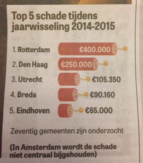
The graph shows a top 5 of Dutch cities based on the damages by fireworks. If you’re wondering “Where’s Amsterdam?”, they don’t collect the data like other cities do.
The dataset of the graph is fine, nothing wrong there. But the way they decided to visualise it is bad. First of all, look at the data labels, it’s clear to see that the design of the visualisation was leading here, as the labels change as soon as they don’t fit within the design of the bar. The second problem with this graph, is that it’s possible to interpret the data in three different ways (if I get creative, I can get four more out of it).
Possible analyses
As the image above shows, there are three basic ways to look at the data visualisation.
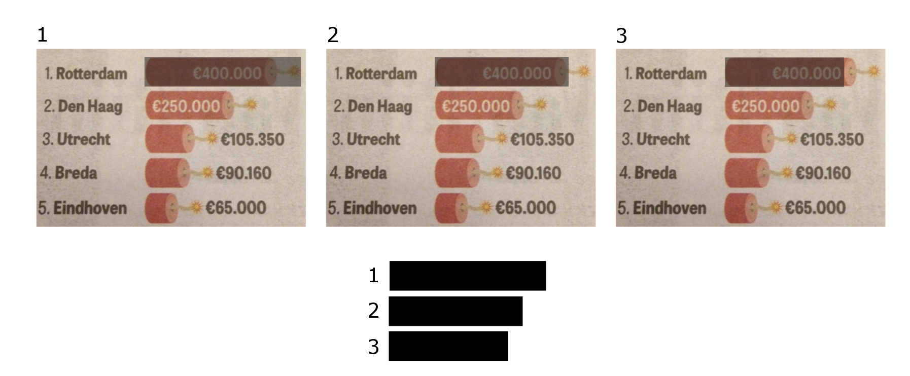
You can compare the firecracker in three ways:
- 1: Firecracker from the most left point, to the most right point, including the fuse.
- 2: Firecracker from the most left point, to the most right point, excluding the fuse.
- 3: Firecracker from the centre of the dark red semi-circle to the dark red semi-circle on the right point.
In my opinion, a data visualisation should help you understand the data, not tell you three different stories.
Three different stories
To show you the problem with the three interpretations, I’ve put the actual data and the data of the three ways of looking at it in a table:
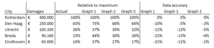
Comparing the data in the visualisation, the comparison of cities can shift anywhere between 1% and 21%, just because the visualisation isn’t clear. And as you can see, none of the three graphs’ data matches the actual data. That’s bad.
How to do it
When visualising, always try to tell the right story with your data. My suggestion would be a less fancy graph, but one that truly tells the story of the data:
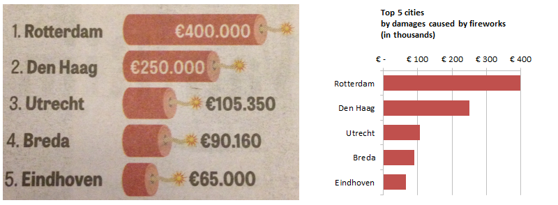
The actual and simplified graph side by side.
The graph isn’t as fancy as the original one, but it’s accurate. It uses an axis to show the numbers, instead of labelling the bars. The end result is a graph that’s easier to read and doesn’t leave room for bad interpretation.
Final thought
The example in this post is quite harmless, as it’s ‘just a fancy graph in a newspaper’. But think about other data analyses, e.g. your monthly sales reports, or startup growth reports. A difference of 21% in data interpretation could badly impact your decision making.
Do yourself a favour: stop making fancy graphs, start making accurate ones.


Leave a Reply
You must be logged in to post a comment.