
For a few years now, we’ve been segmenting our visitors based on the device they use to visit our site. This worked well for a while, splitting visitors based on screen dimensions and whether or not they are using a mouse. As mobile devices matured, our segments stayed the same: Desktop and Mobile. Even when our fridges and coffee machines got tiny screens (is that considered mobile?) we still defined the main difference between the segments as screen real-estate and the use of a pointing device, conveniently forgetting about equally important aspects that make the mobile experience different. Let’s face it, mobile is a connection-dropping, battery-draining, data-plan-exhausting, speed-throttling, attention-sharing monstrosity. Instead of focussing on the device, we need to start focussing on the person holding it, and what they’re going through.
Guess what: this case won first place in the annual behave.org testing awards!
The distraction reversal
Mostly, cell phones are considered a distraction; you shouldn’t phone or text while driving, and whipping out your phone in a restaurant is a faux-pas. But what if you’re a website? Then the mobile phone isn’t the distraction, everything else is. The one thing the website on your phone is fighting for is attention, and you don’t have a lot of it to spare.
Multitasking; dividing your attention among more than one task at the same time, played a large part in humans becoming the dominant species on the planet and is a cornerstone of mankind’s cognition (Leber, 2008). However, studies have shown that while attention can be shared, informational processing can not. Our human brains are simply unable to juggle multiple tasks efficiently (Junco 2012). To keep it simple: every distraction from your main/current task will result in a decrease in your ability to efficiently process the information of this task.
The mobile distraction loop
Anybody that visits your website on their mobile phone will have a constant loop of questions in the back of their mind, (minimally) distracting them from the task at hand. These are a few of them:
- How’s my battery-life doing?
- How’s my reception here?
- Do I have enough left on my data plan?
- What is this costing me, is this download worth it?
- Am I connected to Wifi or is this cellular data?
This question-loop, together with a seemingly endless flow of notifications that a friend recently liked your cat on Facebook are the distractions that have something to do with the device. For some of these distractions, we’ve already created partial solutions; we have a mobile-optimized version of our website, limiting data transfers. We buffer videos, just in case the connection drops, and the phone itself will dim the screen and shut down a few systems if the battery is low. We’re trying our hardest here…
There are also situational distractions, maybe the visitor is driving (please don’t do this), or someone is talking to, or next to them. While the website has no control over the external distractions, we should try to quantify the level of distraction to find out how we can adapt the website to it. But how do we quantify distraction?
Mobile may not be mobile
When we talk about mobile phones, we imagine people using the phone on the go, the very definition of mobile. However, chances are that the last time you looked at your phone, you weren’t mobile at all, but simply sitting on a couch somewhere. Using accelerometer data or GPS data to determine if you’re actually mobile might be overdoing it, so how about the connection type: if a visitor has a wifi-connection, they are somewhere familiar; at home, at work or at their local Starbucks for instance. It’s highly probable they are not actually on the move. When the connection is cellular, the visitor is not in a familiar environment, and with today’s wifi-coverage, they are likely to be moving between two familiar points. Adding the distraction metric, cellular visitors are the most distracted, as they are possibly navigating somewhere, and need to pay attention to their surroundings. To illustrate, try to imagine your mobile users like this:
Validating the cellular/wifi connection theory
Right now, there is no way of accurately measuring if a user is on a cellular connection or on wifi because mobile phones limit access to this type of data for browsers. Luckily, we can mostly gather the data we need in Google Analytics. For the Dutch market, there are a few key mobile providers, which have their own ISP name. Segmenting those verified mobile ISP’s for multiple large clients, and plotting the number of sessions per hour for a 3 month period, results in this:
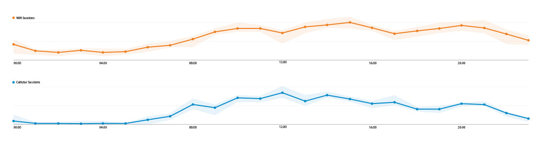
Logically, there are going to be a lot more Wifi-sessions than cellular sessions. I have deliberately left the y-axis values out of these charts so you can focus on the trendlines, not the numbers. If we disregard the values of the y-axis, this would be the result of both lines:
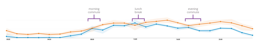
While it may not be perfect, the chart shows that cellular sessions tend to peak (and wifi sessions slightly drop) during commuting hours and lunch breaks, when visitors are possibly moving between two wifi-points. Remember this is data for only two clients, your analytics may say something completely different.
Validating the cellular/wifi distraction theory
Using the same segments, we can also validate the theory that cellular users are in a more distracting environment than wifi users, effectively quantifying distraction as a metric. Some interesting differences I found in our client’s analytics:
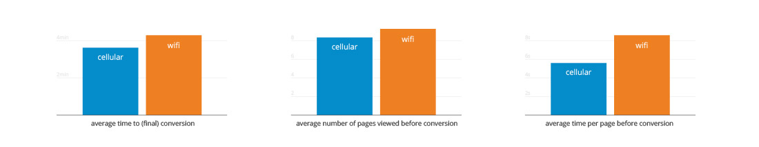
We’ve learned something about our visitors here: Visitors that are on a cellular connection are more task-driven than their wifi-connected counterparts. They move through the site faster, requiring less information to continue their journey. Arguably, the threat of distraction and the lack of concentration are key in this situation. This closely matches Kahneman’s system 1 and system 2.
Catering content to cellular and wifi visitors
Daniel Kahneman’s book Thinking, Fast and Slow describes two different ways the brain forms thoughts, which he calls System 1 and System 2. For brevity’s sake, System 1 is subconscious thought, while System 2 is conscious thought. It’s an extremely interesting book, so pick it up if you haven’t read it yet.
System 1 are things you don’t think about and do without spending any mental energy, while System 2 requires spending mental energy because you’re actually thinking about what you’re doing. Translating this into web-terms: System 1 is a flash-sale website and system 2 is a comparison website. So if a visitor is moving around the site quicker, and making decisions faster it’s safe to assume that they are in a System 1 state of mind.
Now if you would want to sell something to a person in a system 1 state of mind, you might want to limit the amount of information on your page, always allowing that visitor to easily continue to the next step. These visitors don’t care about comparing and don’t want to read 7 pages of product descriptions. They want the product now.
If you want to sell something to a person in a system 2 state of mind, you do the opposite; these visitors are on your site to learn whatever they can about your product, they want the technical specifications, all the dimensions and you bet they will compare your product to your competitors. Show these people all the data you can, they will want to know everything. They want the product after careful consideration.
Testing these approaches is key; if you have the ability to test based on connection type, you can validate these theories for your own audience. Simply run an A/B test with a lot of content, and a little content, and see what your mobile users prefer, based on their connection type.
Ok, so now what?
This isn’t a ‘how-to’ article, where I tell you exactly what you should do. This article should make you think about your own website(s), and I hope it even redefines your definition of ‘mobile’. I hope you are now curious enough to check your own analytics, to see if this whole article even applies to you. I hope you pick up Kahneman’s book to see how you can use it to your advantage. Most of all, I hope you challenge the status quo.
image credit: Yacine Petitprez and FaceMePLS on Flickr.


Leave a Reply
You must be logged in to post a comment.