
In March 2015, I launched a web app for the Dutch Railway Services and I like to check up on the growth of the app every other week or so. The analysis used to consist of several manual steps, but I’ve recently started working with the Google Analytics API in Python. This allowed me to automate my app growth report. The goal of this post to show you the value the Google Analytics API with a use case.
The app growth data
For my app growth analysis, I plot two metrics by week:
- The cumulative new app users by new users: this shows me how many new users have successfully used the app.
- Weekly active users: this shows me if app usage is growing over time.
It’s important to know that I define an ‘app user’ as someone who successfully uses the app. In my case: a user that sees the departure times of trains. Just looking at an app open is too limited in my opinion.
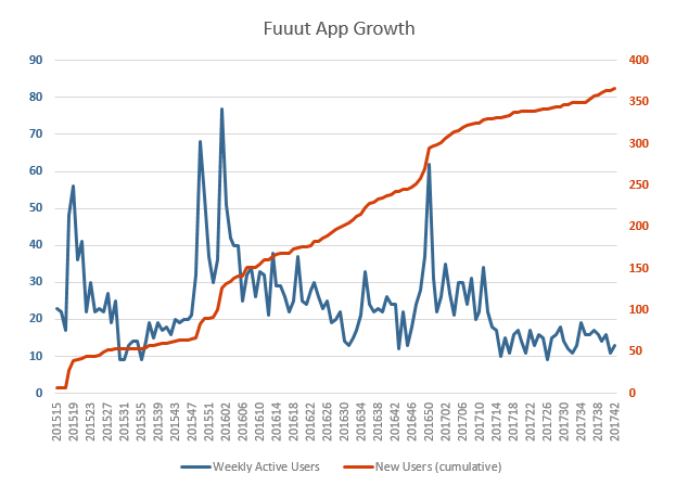
The old app growth report
My old analysis took three manual steps:
- Google Analytics exports: I used to export two reports from Google Analytics with a custom report:
- goal completions by week and visitor type.
- returning users, segmented on goal completion greater than 0.
- Rework the data in Excel: past the new data in Excel and ‘sumif’ it into the ‘New Users cumulative’ and ‘Weekly Active Users’ data.
- Change the graph range to include the new data.
- Take a screenshot of the graph with a snipping tool. Not a necessary step, but I use this to share growth data on Twitter.
This process can also be semi-automated with Excel plugins and skills, but with the API it’s easier to overcome sampling (if my app usage would suddenly explode). And besides that, running reports with Python is just more fun.
The result of the analysis looks like this (I know my app growth is not looking too good):
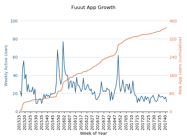
The new app growth report
In the new scenario, I use the Google Analytics Reporting API (v4) in Python. All I have to do is run a single script, and I instantly get an image.
The result looks like this (a more effective way of reporting sadly doesn’t improve my app growth):

The code
My project is based on my quick_gaapi repo on Github, so try that out first if you haven’t already.
The code has to do three things:
- Get the required data.
- Rework the data into the data we need.
- Visualise the data.
To use the code, you’ll have to import these packages:
from functions import return_ga_data
  import pandas as pd
  import matplotlib.pyplot as plt
  import matplotlib.ticker as mticker
  import numpy as np
  import math
Let’s get into the details of each step.
1. Get the required data
First, we have to get the required data. To do so, I import two data sets, one for the new users and one for the weekly active users.
ga_view_id = '100555616'
  query_start_date = '2015-01-01'
  query_end_date = '2017-10-15'

  df_new_users = return_ga_data(
    start_date=query_start_date,
    end_date=query_end_date,
    view_id=ga_view_id,
    metrics=[
      {'expression': 'ga:goal1Completions'},
    ],
    dimensions=[
      {'name': 'ga:isoYear'},
      {'name': 'ga:isoWeek'},
    ],
    split_dates=False,
    dimensionFilterClauses=[
        {
            'operator': 'OR',
            'filters': [
                {
                    'dimensionName': 'ga:userType',
                    'not': False,
                    'expressions':[
                      'new visitor'
                    ],
                    'caseSensitive': False
                }
            ],

        }
    ],
  )

  df_returning_users = return_ga_data(
    start_date=query_start_date,
    end_date=query_end_date,
    view_id=ga_view_id,
    metrics=[
      {'expression': 'ga:users'},
    ],
    dimensions=[
      {'name': 'ga:isoYear'},
      {'name': 'ga:isoWeek'},
      {'name': 'ga:segment'}
    ],
    split_dates=False,
    segments=[{
        "dynamicSegment":
        {
          "name": "Sessions with app use",
          "sessionSegment":
          {
            "segmentFilters":[
            {
              "simpleSegment":
              {
                "orFiltersForSegment":
                {
                  "segmentFilterClauses": [
                  {
                    "metricFilter":
                    {
                      "metricName":"ga:goal1Completions",
                      "operator":"GREATER_THAN",
                      "comparisonValue":"0"
                    }
                  }]
                }
              }
            }]
          }
        }
      }]
  )
2. Rework the data
Second, I rework the data in five steps:
- Merge the two data sets.
- Create a Week of Year column for the x-axis based on the isoWeek and isoYear dimensions.
- Rename the columns to their representative values: Weekly Active Users and New App Users.
- Fill out the NaN’s as 0 (as ever so sad, not all of my weeks have new app users).
- Add a New App Users cumulative column.
Here’s the code:
df_app_growth = pd.merge(df_returning_users, df_new_users, on=['ga:isoYear','ga:isoWeek'], how='outer')
  df_app_growth['Week of Year'] = df_app_growth["ga:isoYear"].map(str) + df_app_growth["ga:isoWeek"].map(str)
  df_app_growth.rename(columns={'ga:users': 'Weekly Active Users', 'ga:goal1Completions': 'New App Users'}, inplace=True)
  df_app_growth = df_app_growth.fillna(0)
  df_app_growth['New App Users (cumulative)'] = df_app_growth['New App Users'].cumsum()
3. Visualise the data
Third, it’s time to visualise the data. I’ve used Matplotlib, their example of a dual axis chart, and some good old Googlin’ to create a beauty of a function:
def plot_dual_axis_line_chart(title, df, main_color, sub_color, grid_color, yaxis_color, xaxis_column_name, left_yaxis_column_name,
                                right_yaxis_column_name, number_of_yaxis_ticks, xaxis_tick_interval, xaxis_label_rotation_degrees,
                                yaxis_tick_width, round_yvalues_to):
      df_plot = df
      fig, ax1 = plt.subplots()
      ax2 = ax1.twinx()

      ax1.grid(color=grid_color, linestyle='solid', linewidth=1, axis='y')

      ax1.spines['left'].set_color(yaxis_color)
      ax2.spines['left'].set_color(yaxis_color)
      ax1.spines['right'].set_color(yaxis_color)
      ax2.spines['right'].set_color(yaxis_color)
      ax1.spines['top'].set_color(yaxis_color)
      ax2.spines['top'].set_color(yaxis_color)

      ax1.plot(df_plot.index.values, df_plot[left_yaxis_column_name], main_color)
      ax1.set_xlabel(xaxis_column_name)
      ax1.set_ylabel(left_yaxis_column_name, color=main_color)
      ax1.tick_params('y', colors=main_color, width =yaxis_tick_width, length=0)

      ax2.plot(df_plot.index.values, df_plot[right_yaxis_column_name], sub_color)
      ax2.set_xlabel(xaxis_column_name)
      ax2.set_ylabel(right_yaxis_column_name, color=sub_color)
      ax2.tick_params('y', colors=sub_color, width=yaxis_tick_width, length=0)

      yaxis_left_rounded_max = int(round_yvalues_to * math.ceil(float(df_plot[left_yaxis_column_name].max()) / round_yvalues_to))
      yaxis_right_rounded_max = int(round_yvalues_to * math.ceil(float(df_plot[right_yaxis_column_name].max()) / round_yvalues_to))

      ax1.set_yticks(np.arange(0, yaxis_left_rounded_max*1.01, yaxis_left_rounded_max/number_of_yaxis_ticks))
      ax2.set_yticks(np.arange(0, yaxis_right_rounded_max*1.01, yaxis_right_rounded_max/number_of_yaxis_ticks))

      ax1.set_ylim(ymin=0, ymax=yaxis_left_rounded_max*1.02)
      ax2.set_ylim(ymin=0, ymax=yaxis_right_rounded_max*1.02)

      xticklocs = np.arange(0, len(df_plot.index.values), xaxis_tick_interval)
      ticks = df_plot[xaxis_column_name][0::xaxis_tick_interval]
      ax1.set_xticklabels(ticks)
      ax1.xaxis.set_major_locator(mticker.FixedLocator(xticklocs))
      plt.xlim([0,len(df_plot.index.values)])
      for tick in ax1.get_xticklabels():
          tick.set_rotation(xaxis_label_rotation_degrees)

      plt.title(title, y=1.08)
      fig.tight_layout()
      plt.show()
Now with this function, it’s super easy to plot your graph. It includes customisation features, like setting your colours, but also a custom value to round y-axis values to (e.g. 50):
plot_dual_axis_line_chart(
      title = 'Fuuut App Growth',
      df = df_app_growth,
      main_color = '#2d6891',
      sub_color = '#d9734e',
      grid_color = '#dddddd',
      yaxis_color = '#ffffff',
      xaxis_column_name = 'Week of Year',
      left_yaxis_column_name = 'Weekly Active Users',
      right_yaxis_column_name = 'New App Users (cumulative)',
      round_yvalues_to=50,
      number_of_yaxis_ticks=5,
      xaxis_tick_interval=5,
      xaxis_label_rotation_degrees = 90,
      yaxis_tick_width=0,
  )
And the end result is this beautiful graph:
The joy of automation
With the API, it is possible to automate many types of analytics reports that you can’t get straight out of the interface, e.g. an app growth report. It’ll take some time getting used to setting things up on your first few tries, but it’s worth it in the end. It will reduce the time you need setting up the report and will increase the time you can spend analysing. A healthy investment.


Leave a Reply
You must be logged in to post a comment.