
I was inspired by this article by Philip Walton. Device information in most web analytics tools is sort of meaningless if you are interested in how your website’s responsive design performs in terms of viewport width instead of a specific type of device.
I always kept this idea in the back of my head, and when one of our clients was interested in how their new design was performing in real life we had a nice opportunity to pull this old trick out of our sleeve.
Having fun with the MediaQueryList object
The most important player in this game is the MediaQueryList object you can create by using the window.matchMedia method. Important side note: This method is only supported from IE10, IE Mobile 10, Android 3.0, Safari 5.1 and Safari Mobile 5.
To get a feeling of what this method does open your console and type: window.matchMedia("(min-width: 400px)").matches or window.matchMedia("(orientation: portrait)").matches
This should give you a boolean whether the statement matches or not. Play around with this and try to create a statement that applies to your own website. Check the MDN documentation of the MediaQueryList object here.
List your website’s breakpoints
So first determine what breakpoints you want to test. Of course your website is fluid and doesn’t have device based breakpoints, but may have some interesting changes in layout on smaller (or larger) widths. So you want to have an indication of how these layout changes perform relating to each other. Here is how we set our breakpoints variables:
var breakpoints = {
    s: '(max-width: 767px)',
    m: '(min-width: 767px) and (max-width: 959px)',
    l: '(min-width: 960px) and (max-width: 1200px)',
    xl: '(min-width: 1200px)'
  };
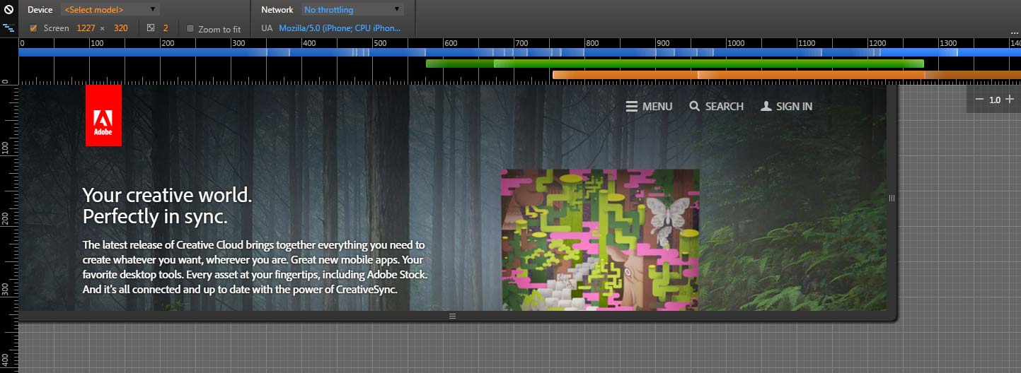
It’s easy to get an overview of the breakpoints that exist on your website. Open your Google Developer tool and switch to mobile view by clicking on the mobile device icon. At the top of your page you can see in interactive visualisation of your websites breakpoints, which can help by defining a list. See an example of the adobe.com website below.
Fire a breakpoint event
First you have to check if the matchMedia function is supported by the browser to prevent errors.
// Check if matchMedia API exists
  var matchMediaIsPossible = typeof window.matchMedia !== 'undefined';
Add your set breakpoint object in a function that checks if the keys matches with the current width of your page.
if (matchMediaIsPossible) {
    Object.keys(breakpoints).forEach(function(breakpoint) {
      var mediaQuerySize = window.matchMedia(breakpoints[breakpoint]);
      // Set the initial breakpoint on page load.
      if (mediaQuerySize.matches) {
        // Fire your analytics event right here
      }
    });
  }
Ideally you want to add a listener to check if your page gets resized.
mediaQuerySize.addListener(function() {
        if (mediaQuerySize.matches) {
          // Update your analytics event right here
        }
  });
There you go, this is the basic setup of your breakpoint script. You can see a working example in this pen.
Measure your website’s version in Google Analytics
In this paragraph, Erik Driessen, one of our web analysts, explains how to add this data to Google Analytics.
As a next step, you might want to add the data to Google Analytics. Normally, when you want to analyse your website across devices, you’d look at the device category defined by Google. But with the rise of phablets, and support for multitasking on tablets, it’ll become less and less clear what version of your website a user is looking at.
The breakpoint script allows you to add the website’s version to Google Analytics. This way, you ignore the device type, and focus on the different versions your website has. One of our clients had four:
- Mobile
- Tablet portrait
- Tablet landscape
- Desktop
We’ve increased their insights on the website performance, by setting a custom dimension on every first pageview of a sessions. Here’s a standard JavaScript example:
  //set up breakpoints
    var breakpoints = {
      'mobile': '(max-width: 767px)',
      'tablet portrait': '(min-width: 767px) and (max-width: 959px)',
      'tablet landscape': '(min-width: 960px) and (max-width: 1200px)',
      'desktop': '(min-width: 1200px)'
    };

    // Check if matchMedia API exists
    var matchMediaIsPossible = typeof window.matchMedia !== 'undefined';

    if (matchMediaIsPossible) {
      Object.keys(breakpoints).forEach(function(breakpoint) {
        var mediaQuerySize = window.matchMedia(breakpoints[breakpoint]);
        // Set the initial breakpoint on page load.
        if (mediaQuerySize.matches) {
          ga('set', 'dimension1', breakpoint);
          ga('send', 'event', 'Breakpoint', 'Set', breakpoint, {'nonInteraction': 1});
        }
        // Set updated breakpoint on page resize
        mediaQuerySize.addListener(function() {
          if (mediaQuerySize.matches) {
            ga('set', 'dimension1', breakpoint);
            ga('send', 'event', 'Breakpoint', 'Change', breakpoint, {'nonInteraction': 1});
          }
        });
      });
    } else {
      //set to desktop if matchMedia API is not available
      ga('set', 'dimension1', 'desktop');
      ga('send', 'event', 'Breakpoint', 'Not available', 'desktop', {'nonInteraction': 1});
    }
Code example for setting the breakpoint custom dimension
Notice that I don’t use the actual breakpoint labels (e.g. xs), but the associated devices. Labelling the custom dimension with a name that’s easy to understand, makes it easier to use for those who are not familiar with CSS breakpoints. Don’t forget to change dimension1 to match the custom dimension index in your Google Analytics settings. I also set the dimension to desktop when the matchMedia API is not available. Our data showed that all of these sessions were on desktop.
A powerful report to use this dimension in is the Enhanced Ecommerce report. In this report, you’ll instantly see how your website versions are performing. Let’s look at an example:

The table from the Enhanced Ecommerce report, broken down by the custom dimension Website Version. The data is anonymized.
You can clearly see that mobile performance is lacking behind compared to the desktop performance. Though users might pick a product, and finish their order on desktop, this is a good indication that the flow on mobile could be improved. The benefit of the custom dimension is that we ignore the device a user has, and focus on what CSS defined version of a website the user is looking at.
Conclusion
You can set these variables in any way you would like to see in you results. Point is that you can get results on a layout width you would like to see instead of device statistics configured by your analytics tool.
var layoutToTest = {
    the one with the special new background image: '(min-width: 320px) and (max-width: 460px)',
  };
Playing around with the MediaQueryList can give you some really useful insights. It gives our clients designer a solid proof to make decisions based on actual live testing.


Leave a Reply
You must be logged in to post a comment.