
This week, I attended the Data Visualisation Summit in London. This post contains my 7 key takeaways from the presentations I attended. For those of you looking for a quick snack, here’s the list:
- Don’t forget where your data comes from
- How web design is a form of data visualisation
- Automate routine (with Nightingale)
- There is no BI Team
- The power of Topological Analysis (TDA)
- Grow a data visualisation culture
- Visualise in the real world.
If you’re interested in the details, read ahead.
1: Don’t forget where your data comes from
Twitter Data Architecture by Robert Stapenhurst and Filipa Moura, Twitter
The first talk was about data architecture of Twitter. The main point was to show what happens to the data before it ends up in the hands of analysts and visualisation experts. Looking at requests, they describe two main types:
- Anticipated: how many people saw my tweet?
- Unanticipated: if a football player with a car preference for Mercedes scores during a match, how many people talk about that car brand directly after the goal.
The anticipated part is easy to answer, and therefore included in Twitter’s analytics platform. The second question is more complex. For these questions, they’ve made a report builder, allowing users to run custom queries to answer questions.
Besides this, they briefly discussed analytics.twitter.com, which I didn’t know about. It shows you an overview of your twitter stats of the last 28 days. Here’s a view of my data:
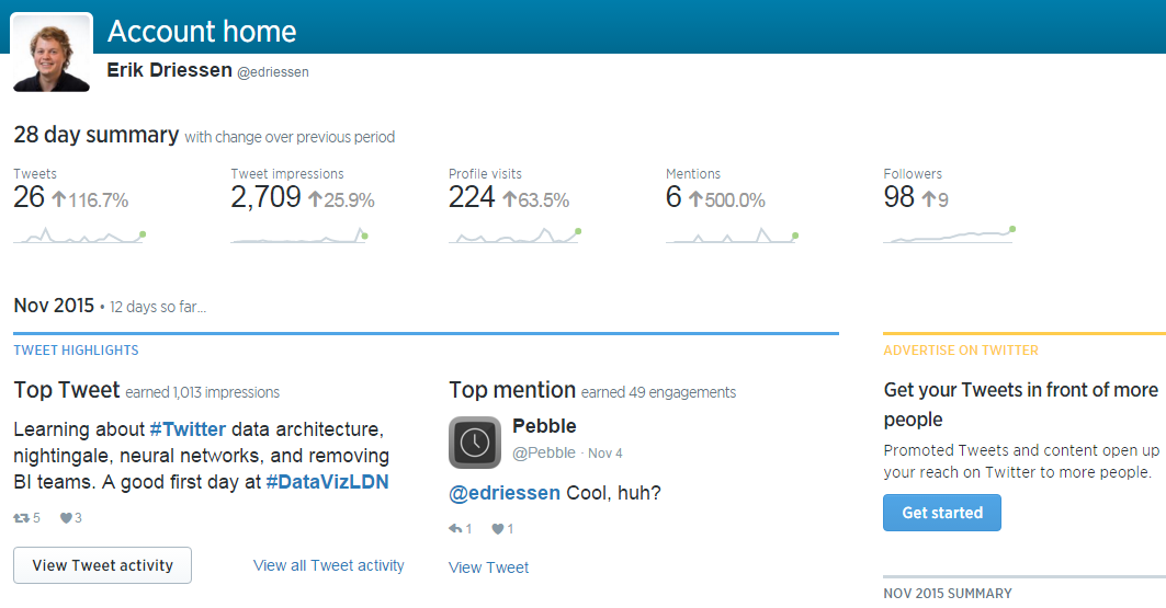
Sample of the Twitter analytics dashboard of my account
It looks like the tweets about the summit made my numbers go up.
2: How web design is a form of data visualisation
Get Creative With Data by Imran Younis, LateRooms.com
Imran talked about using data to fuel creativity. He says the best way to improve your website is by using small teams that contain every role you need, e.g. a designer, developer and analyst, and use these teams to iterate quickly. The workflow follows the concept of the design sprint. It contains five steps:
- Idea: use data to identify problems and sketch a possible solution. It’s important to use an hypothesis for your idea.
- Build: work together with a developer to create a working version of the idea and use your sketch to explain it
- Launch: GOOB (Go Out Of the Building). With your new version ready to test, go out there and let users test it.
- Learn: use the feedback gathered to further improve the variation;
- Put it live (or not): after doing both qualitative tests (users) and onsite testing (a/b testing), see if the data shows you that your solution works as you expected it to work. If so: put it live. In either case, repeat step 1 to further optimise your website.
After this, repeat the process. You should always be testing and updating your website. As an example, he shares the frequency of code releases by Amazon: one every 11.6 seconds(!) on average. And less than 50% of the changes actually work.
What was really interesting to me about this talk is the way it shed a new light on web design for me. Though he didn’t directly describe as such, web design is a way of data visualisation. If your designs are driven by data, then the website (the visualisation) changes based on user behaviour (the data). Interesting right?
3: Automate routine
Talking Geek and Human: How to Make Your Visualisations Visions Actually Happen by Emily Cadman, Financial Times (FT)
Emily had a great talk about how to make sure your visualisations happen. She started with the struggle that most of the visualisers have: there are quite a few, maybe even too many, day to day tasks that keep us from doing the actual projects we want to do. To solve this at FT, she started a project to automate most of the visualisations for FT. The main challenge was to let everyone create graphs, without allowing them to screw them up visually, since all graph should match the FT design standards. The solution they created is Nightingale.
Nightingale is a tool that allows everyone at FT to create basic graphs according to the FT standards. It allows users to copy and paste data into an input field. After that, it generates the graphs for them. It has two ways to guard the quality of the graphs:
- Style: users can’t change the styling (colours, tick layout, etc.) of a graph, making sure that they match the style guide of the FT.
- Type of graph: Nightingale automatically picks a type of graph that’s the best fit for the data set. A set that looks like a trended set of data points, will be a line. A categorized set will turn into a bar chart. You can choose another visualisation, but they deliberately hide them below the fold, only showing the best visualisation by default.
It’s a great way to make sure all graphs used in your company’s communications (reports, presentations, social media posts) match the same style guide. The great part? It’s open source, free to use. Here’s the link on GitHub: Financial Times Nightingale.
4: There is no BI Team
Putting Data Visualisation and Analytics into the Hands of Everyone at Skyscanner by Mark Shilton, Skyscanner
Mark’s talk began with the history of typing. When typewriters were invented, there used to be rooms filled with people that typed messages for other people. Nowadays, if you’d tell someone you don’t type your own texts, they’d probably laugh at you. Nobody has someone else to do all their typing today.
At Skyscanner, they look at BI in the same way. Skyscanner used to have a separate BI team. They did all the BI work for other departments. But they’ve changed this. They restructured all teams according to Spotify’s Tribe system. In this system, squads are responsible for a specific part or function of the site, e.g. Flight search. A squad should be able to operate independently. This way they can quickly develop their part of the website. A squad also contains a BI person. If a BI team would be a separate department, they’d sometimes have to wait on results from another team. For more info on the Tribe system, read Spotify’s whitepaper.
Besides that, they try to educate their company, matching tools to their audience:
- Use Excel for users who mainly work with Excel.
- For more advanced analytics colleagues, use tools like Tableau.
- Teach your developers how to analyse data with code, e.g. with Python and Pandas.
By teaching everyone how to handle data with graphs in the tools they’re familiar with, you’ll move the focus of their questions. Where people would ask “can you put this in a dashboard for me” before, they now ask “where can I get the data I need”. The main point is here is to educate people. Don’t just do the things for them.
5: The power of Topological Analysis (TDA)
6 Crazy Things Deep Learning and Topological Data Analysis Can Do With Your Data by Edward Kibardin, Badoo
A different but really interesting talk. It was completely new to me, so this part might be a bit vague. With deep learning, you throw data into a system, and see how the system clusters your data. With this technique, you get an interesting visualisation showing the cluster of e.g. users. The graphs look like a sort of abstract galaxy plot to me. What’s really interesting is how it can learn from your input. Applying TDA, you’ll add labels to specific clusters, e.g. their common interest. If you apply labels to three groups and repeat this step about three times, the cluster plot will change like this:

Image by KD Nuggets
As you can see, the complex network has changed to a clear collection of clusters. So by guiding the system by manually grouping clusters, the system automatically identified others by itself. If you’d like to read more about the usage of TDA, read Edward’s post on KDnuggets.
6: Grow a data visualisation culture
Using Shiny to Visualise Crime and Collision Data by Henry Partridge, Transport for London
Shiny is a tool to create visualisations with the R programming language. It allows you to quickly create interactive data visualisations and publish them on the net. The nice thing is that it generates it in HTML, CSS and JavaScript, but doesn’t require any knowledge of those languages.
Henry talked about how he learned about Shiny, picked it up with some colleagues to make visualisations, and started spreading the knowledge within his company. There’s now a group of over 50 people at his company using Shiny for visualisation. I loved the way how a group’s interests in visualising by code, generated a whole group of people doing the same.
7: Visualise in the real world.
Information Experience Design by Kevin Walker, Royal College of Art
Kevin, from the Royal College of Art, showed visualisations that were closer to art than to the other graphs that most of us see in our day to day jobs. He showed some great examples of data visualisation in the physical world. Kevin and his students use a four step process to create the visualisations:
- Decomposition
- Pattern recognition
- Abstraction
- Design
A creative visualisation that was created by these four steps was the ‘bell visualisation’. A student used a graph showing travellers in the London Underground over time. Based on the two peaks, one in the beginning of a working day and one at the end, he created two bronze bells. This visualisation created a sound out of data. If you’re interested, here’s a link of a new project by the same guys: http://www.change-ringing.co.uk/. Other projects of interesting physical data visualisations can be found here: http://ied.rca.ac.uk/.
Bonus round
During some of the talks and the panels at the end of each day, some nice anecdotes, quotes and best practices were discussed. The final takeaway is a list of these:
- Visualising bad data is like putting lipstick on a pig. This quote came up while discussing a question about the point of visualising data if the data you’re using is bad to begin with. A nice addition to the quote is that you can at least see that it’s a pig with lipstick. So a visualisation might actually show you your data is bad.
- It’s important to determine the goal of your dashboard. All data in it should you help you to achieve that goal.
- Open up data to everyone. Make your companies’ data accessible to everyone within your company. This way everyone can grab the data they want themselves, empowering everyone. The level of data access may vary, e.g. a data engineer has access to raw data, and other people might only have access to aggregated reports.
- Process data before you visualise it. Most visualisation tools are good a visualising data, but not as good at handling the data for it. Because of this, you should do all the data processing before you load into your tool.
That’s a wrap
These are the main takeaways of the data visualisation summit for me. I hoped you learned something from my gist of the summit. If you have any additions, feel free to comment.


Leave a Reply
You must be logged in to post a comment.